Blog Articles / Accessibility by Design: How Clinia Builds Inclusive Healthcare Experiences
Insights
Our Solutions
Accessibility by Design: How Clinia Builds Inclusive Healthcare Experiences

Written by Clinia
Published 2026-02-04
Improving access to care starts with ensuring everyone can use the digital experiences we create—from people who rely on screen readers or captions to those who navigate with a keyboard or need clearer, simpler content. Accessibility isn’t just a checklist at Clinia but something we actively work at. To unpack what that looks like in practice, we sat down with Scott Riley, our product designer, to talk about the standards we follow, the habits we’ve built, and why inclusive design is inseparable from good healthcare experiences. Here’s what he shared.
Let’s start with the basics: what standards guide accessibility across Clinia’s products, and how ambitious are we in applying them?
As a baseline we follow the Web Content Accessibility Group (WCAG) guidelines. They’re a great starting point for web accessibility, but it’s important to remember they provide the minimum required actions and thresholds for building accessible experiences. We build on top of them with our own principles and practices.
The initiatives to ensure that web accessibility is codified are quite disparate right now, but they’re well worth being aware of as they progress. In the United States, the Americans with Disabilities Act (ADA) mandates certain requirements for public sector and government services. In Canada, the Accessibility for Ontarians with Disabilities Act (AODA) mandates similar requirements, and in the UK there are various laws that fall under, or are adjacent to, the Equality Act 2010. Most of these revolve around mandating a specific set of WCAG requirements but tend to be focused on public sector and government services. As a minimum, at Clinia, we aim for WCAG 2.2 AA compliance. It’s a thorough scope of requirements and guidelines, and sets the foundation for accessible experiences.
Accessibility can’t be a one-off. How do you keep it alive through the whole product cycle?
It’s a multi-layered approach. At times we need to be overt about accessibility guidelines and bake continuous testing and development of accessibility features into our product delivery processes. Other times, we’re thinking in terms of inclusion and democratization, which involves collaborating and researching alongside disabled folks and folks with cognitive impairments and neurodevelopmental disorders.
We also need to bake it into our processes, particularly our design process. When we design while guided by certain principles, we develop the ‘muscle’ of delivering accessible experiences by default. By building a culture of awareness and open feedback around accessibility, we ensure that we’re always able (and willing!) to evaluate the accessibility of our work from the early stages.
What’s distinctive about Clinia’s accessibility approach and how does it connect to Clinia’s design philosophy?
Beyond the very important work of hitting our minimum requirements, treating accessibility as a way to democratize access to health experiences is core to how we design and explore new product areas. It’s a core focus: most of our design principles stem from accessibility principles because accessible design is good design.
We also explore the less-documented areas of accessibility—things like cognitive accessibility, which are under-explored and under-regulated in my opinion. In practice, inclusive design is about ensuring we aren’t designing people out of specific solutions or tools. Inclusive design is accessible design, but simply being accessible doesn’t mean we’re embodying the principles of inclusive design. We’re constantly thinking in terms of information density, progressive disclosure, and cognitive load. Using clear language and skipping the medical/business jargon is important too—especially for folks with autism and ADHD, dyslexia and dyscalculia, and even folks who are just pretty stressed out or tired.
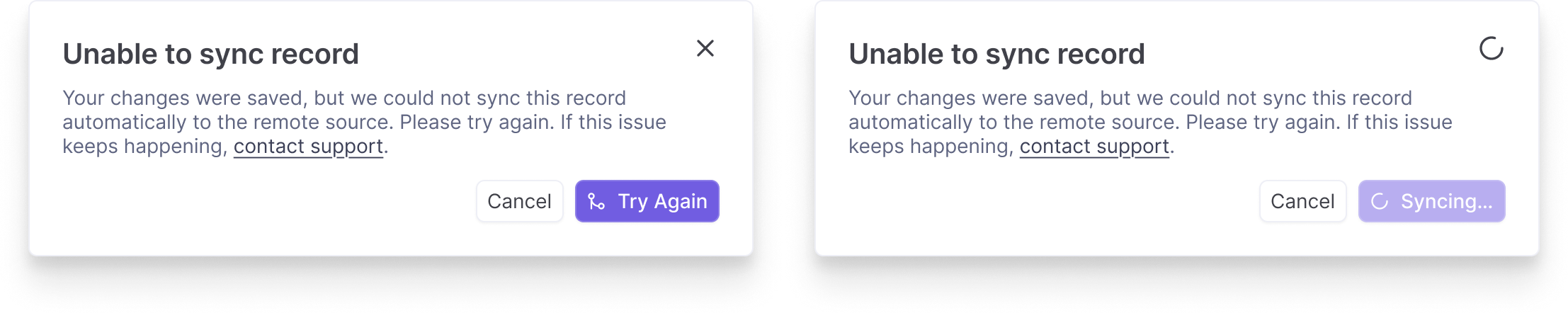
Alerts and error messages are a great example of how smaller accessibility considerations combine to make a big difference. Using clear language, giving folks a clear path to fixing or avoiding issues, and effectively communicating the state of any action lead to clear, low-stress messaging. Getting any (or all!) of these wrong can lead to confusion, stress, and frustration.
In your day-to-day work, how do accessibility principles influence the choices that are made and creativity?
By embracing the constraints they provide. Design is a discipline of constraints. Web and product design are no different. It’s easy to treat design as a form of unbridled creativity, but it’s just as technical, constrained, and oftentimes systematic as any other technical skill.
At this point, accessibility principles are pretty much baked into my process. I’m constantly checking contrast, looking for areas of dense information, and trying to ensure we’re presenting conventional, usable, and clear interfaces. My own personal rule essentially boils down to If it’s not accessible, it’s not good. With design, we’re making dozens of small evaluations as we go: Does this sit right? Is this aligned properly? Am I using the correct colour to signify this action/state?
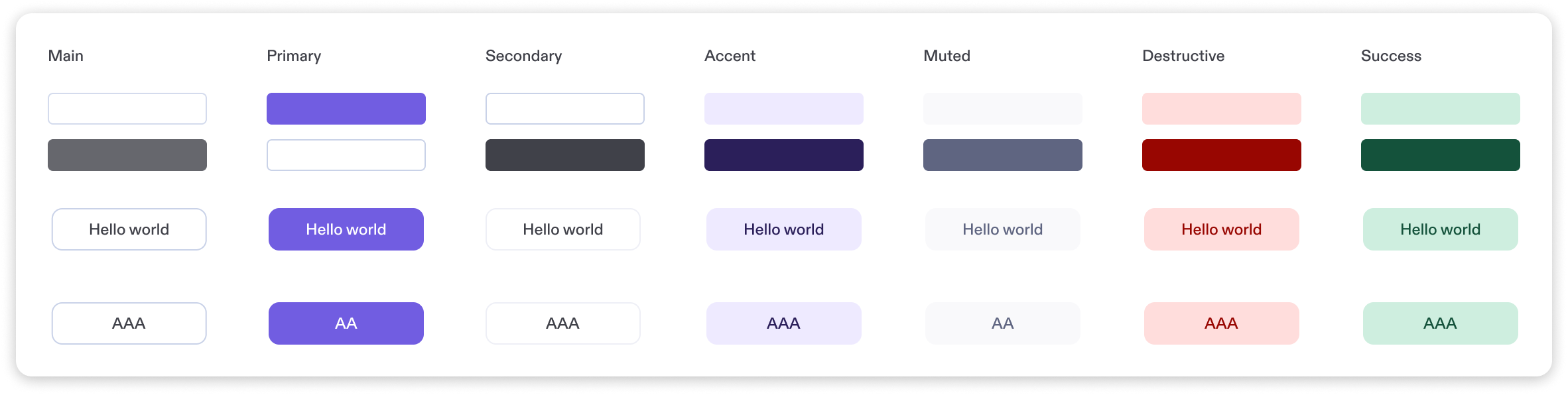
The Clinia product colour palette is a core part of our design system, which is used in all the products we ship. By baking the basics of accessibility into our work at a systemic level, we’re able to bring sensible, usable, and accessible defaults into any project that uses our design system. Striving for ‘accessible by default’ means that everything that uses our design system starts with an accessible foundation.
Ensuring that Is this going to be usable by everyone? makes its way into that perpetual cycle of micro-evaluations makes this almost second-nature now.
From what you’ve seen, does designing for accessibility end up making things better for everyone?
I’ve yet to encounter a situation where making something accessible hasn’t improved the overall experience. Usually you’re simplifying something that was too complex to begin with, or adding and refining different interaction modalities. If your interface makes sense when it’s read out loud to someone, it’s going to make sense in almost any context. And if you solve for keyboard navigation for screen-reader users and folks with limited mobility or proprioception, you instantly get very good keyboard navigation for everyone, for free.
Finally, how do you see the business value of accessibility?
It feels kind of obvious, but by ensuring products, websites, and services are usable by, and valuable for, the highest amount of people possible means you’re not artificially constraining your user/customer base purely through poor accessibility. Users of assistive technology are still users, still customers, and they should have the best experience possible with our products. It will be a different experience, but it can be just as valuable and empowering.
Beyond expanding your customer base, businesses that overlook accessibility-first design miss out on deeper strategic advantages: stronger brand trust, reduced legal risk, improved SEO and usability for all users, and innovation through inclusive problem-solving. Accessibility is actually a competitive differentiator. Companies that embed it from the start future-proof their products, foster loyalty among underserved communities, and align with evolving global standards—while those that treat it as an afterthought risk exclusion, reputational damage, and lost market share.
Any closing thoughts?
Accessibility is never a finished project for us but a set of habits, constraints, and questions we keep bringing back into the work. As we grow the platform and broaden who we serve, we’ll keep learning, testing, and improving so that more people can access and benefit from the healthcare experiences we build. We hope this gives a clearer view of how we think about accessibility today, and where we’re pushing ourselves next.
To close, we’re sharing the accessibility principles we defend at Clinia: a simple manifesto for how we design, and what we hold ourselves accountable to.
We value clarity over cleverness. Because of this, we use plain language and intuitive layouts, not jargon or abstract metaphors.
We value access for everyone, not just the average user. This is why we avoid treating people as edge cases—screen reader, voice control, and keyboard-only users are always considered.
We value reliability across devices and environments. We test on a range of screen sizes, zoom levels, and assistive technologies.
We value predictability and user control. Consequently, we present medical information in consistent formats, with clear labels and stable layouts
We value legibility and calm visual hierarchy. We prioritize readable typography, contrast, spacing, and structure over trendy visuals.
We value inclusive defaults. We assume nothing about ability, vision, dexterity, or cognition.
We value feedback and error recovery. We make errors obvious, explain them clearly, and offer ways to fix them without stress.
We value cognitive economy. We use progressive disclosure and careful information architecture to guide users through complex moments.
We value collaboration with underrepresented users. Accordingly, we interview, test with and listen to underrepresented folks throughout a project—not just at the end.
We value ethical responsibility. We treat accessibility as a basic right, not a feature or a compliance checklist.